You spent hours on that ad.
The creative. Dialing in the targeting. Fighting for the budget.
Finally, the moment of truth: you hit publish.
But then…the click lands on your homepage.
Yeah, THAT homepage. The one with the 11-link nav bar. The hero image that took 3 months of stakeholder sign-offs, the “We’re Hiring!” banner from 2022. The chatbot that pops up before the page even finishes loading.
You paid real money for that click. Then your homepage handed them 11 exit routes.
And THAT’S why….
Your Homepage Is Eating Your Ad Budget Alive.

The thing about homepages is, they have a really hard job.
They’re built to do everything, for everyone.
Investors. Analysts. Job seekers. Existing customers. Your mom who wants to finally understand what you do.
None of that is built for someone who just clicked your ad.
That person has a question, and intent. But they might have ZERO context on who you are or what you do.
When you send that kind of paid traffic to a page designed for the whole world, you’re basically dropping a prospect into a corn maze.
Unfortunately, I also see this problem even with “landing pages,” because Marketers often just build a homepage with the nav removed. Otherwise, it’s the same bloated messaging trying to do too much. The same 5 CTAs all fighting each other. A homepage in a landing page costume.
CPL creeps up. Performance dips. You get a meeting invite from someone in leadership to talk about why paid “isn’t working.”
The ads aren’t broken. The destination is broken.
This isn’t a small problem: about 52% of paid ad traffic is STILL going directly to homepages.
And that’s not just a problem for your ad budget. It changes how Google TREATS your ads.
Previously On: Google Moved the Goalposts Again
Google’s recent update means they may not even SHOW your ads if you’re sending people to a generic homepage. No matter how big your budget is.
That’s because their new ad quality prediction model looks at the post-click user experience. If Google finds your landing page isn’t both useful and relevant to the user…they might not even SERVE your ad!
That means, you’re not even getting to the point of losing a conversion.
You’re getting cut off before anyone sees the ad.

Deep breath. So…what do you actually do about it?
The 4 Landing Pages You Need
Tas Bober is a B2B SaaS landing page strategist who’s spent years diagnosing exactly this problem. She teamed up with the landing page experts at Unbounce to build a framework + a free toolkit to fix it.
It’s called the Core Four.
And it works for ANYONE in B2B, whether or not you’re on Unbounce. More on that later.
The whole idea is this: no, you can’t keep sending people to your homepage. But you don’t need 80 landing pages with 150 variants, either.
You need 4 pages, each 1 built for where your buyer actually is in their journey.
Here’s what each 1 does:
1️⃣. The Overview Page
Think of this as your actual paid media homepage. A dedicated first-touch that does what your homepage can’t: focus.
1 single message for the person who clicked, routed to the right next step. No company news, no 6 competing CTAs, no 11 escape routes.
There are 2 versions – 1 for teams with multiple products and audiences, 1 for single-product teams:
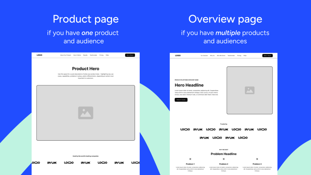
Start with your overview page. It’s the 1 most people need first.
2️⃣. The Comparison Page
This is buyers actively weighing their options. And “options” isn’t only the competition – almost 60% of B2B deals are lost to the status quo, not a direct competitor.
That’s why Tas’s take is that your comparison page has to address ALL the alternatives, including doing nothing. This page turns you into a guide helping the buyer make an informed decision, instead of a vendor trying to win a feature war.
Don’t have this page? G2 and Reddit are writing it for you right now.
Speaking of which…
3️⃣. The Trust/Social Proof Page
I see way too many teams skip this 1. This is the page people are looking for when they type “[your company] reviews.”
If there’s no dedicated page waiting for them, you’re handing over the narrative to everyone else. Your Trust Page is where you take it back.
It delivers proof. Real testimonials, and objections handled head-on. Let your customers sell you, instead of a G2 grid you have zero say over.
4️⃣. The Demo Request Page
This is it. Your conversion page. The closer.
The mistake I usually see is teams building this page FIRST, and then sending all the traffic there immediately. Tas calls it “asking for a marriage proposal on the first date.”
Remember: Buyers can visit sites ~30+ times before becoming a MQL. Without setting up your education pages first, there’s nowhere to build your case first.
Build the education pages first. THEN the closer.
Tas’s templates are being released in phases. The first 1 is live now. Grab it here.
Hold Up: A Note on Conversions
Sounds good, right? But here’s the thing that’ll mess with your head a little:
A well-built Core Four might actually LOWER your raw conversion numbers…and that can be a GOOD thing.
It sounds counterintuitive, but in B2B especially, high conversion rates can be a vanity metric, because easy conversions often mean wrong-fit leads that end up ghosting you.

That’s why Tas built the Core Four around consumption over immediate conversion.
Each page in the toolkit helps buyers SELF-qualify.
Yeah, volume might drop a little. That’s because the wrong buyer will bounce earlier, so lead quality goes way up, and the pipeline you generate actually closes.
Fewer garbage leads. Less wasted discovery time. More deals. And most importantly, more credit from the sales team. Let’s rock.

So, What’s In Your Toolkit Now?
The free toolkit from Tas & Unbounce comes with everything you need to get going. No developer. No designer. A team of 1 can have this running today.
The Overview Page Templates are live now: 2 Figma templates: one for multi-product teams and one for single-product teams. My favorite part: every block is annotated with the WHY behind it.
Also included in the toolkit is an Audit Checklist: run your existing pages through this before building anything new. Sometimes a fix beats a full rebuild.
The other 3 are dropping over the next few months.
- Comparison page
- Trust/social proof page
- Demo request page
Sign up once, they come straight to your inbox with more tips to build pages that match today’s B2B buyer journey.
Already an Unbounce user? The templates live right inside the builder.
Not a customer yet? NBD: the Figma files are still yours. Free.
👉 Get your Core Four Toolkit here
Quick reminder before you go:
Your ads are NOT the problem.
Stop optimizing the creative if the page it lands on is a mess. Stop increasing budget if you’re sending traffic into a nav bar with 11 escape routes. Stop building Frankenstein pages that serve internal needs instead of helping your buyer get clarity.
4 pages. Built by experts in the buyer journey. Consistently tested.
That’s the system. That’s what lowers CPL without spending more. That’s how you keep up.
Go build your Core Four. Your ad budget will thank you.